Come here often? I do. Another Roy Povarchik webinar watched, another opportunity for me to catch you up on what was discussed. In this case, I’ll recap a recent webinar Roy hosted for Penguin Strategies, “How to Make Sure No One Converts from Your Blog.”
Blog conversion rates are obviously important, so what’s the key? To have Roy tell it, there is no single one. There are many concepts and techniques which, when employed properly and in conjunction with each other, can help increase your conversation rate.
Here are 5 of the easiest ways to optimize your blog and turn it into a lead generation tool -
1. Blog Layout Matters: Clean, Clear, and Under Control
This may seem commonsensical, and that’s because it is. Increasing blog conversion rates is not rocket science. It’s about getting the right people in the audience to see the right message. People often overlook this simple truth, which works to your benefit.
This is where your layout and design come into play. For your visitors to see your CTA, it’s crucial to avoid clutter and confusion. The guiding principle for layout and design should be to keep things clean. Don’t crowd your page or overreach on offerings.
The first step is to limit the number of CTA banners you have on your blog. If you have more than 3 on your page, ask yourself if they’re absolutely necessary. “Less is more” is not just a mantra but a testable hypothesis.

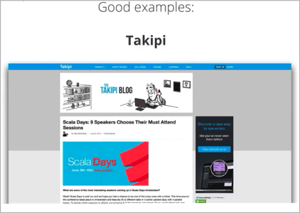
Roy pointed out that when Takipi, a website devoted to diagnosing code errors, replaced its entire sidebar full of banners, social media buttons, and disparate signup offers/CTAs with one single fundamental CTA, they saw a 27% increase in conversions.
Before you select which CTA to feature, determine what your goal is. Are you looking for more email signups, demo registrants, or free trials? Once you’ve decided, make sure that any CTA you show on the blog aligns with this objective.
Finally, display your CTAs as close to the top part of the page. Consider the fact that 100% of your visitors see the top of your blog page - and that number tapers off more and more the further down the page you go.
2. Quality Content Marketing: Put Your Best Foot Forward
Of course, if you could just will it into being so, your content would be the best on the web. The trick is knowing what costs are worth paying for good quality, and where to focus your limited time and energy.
The quality of your content is your first point of contact with your visitors. If you don’t have quality, you’ll find it extremely challenging to increase your blog’s conversion rates. Therefore, quality reigns superior to quantity. This should be obvious, but unfortunately it bears repeating.
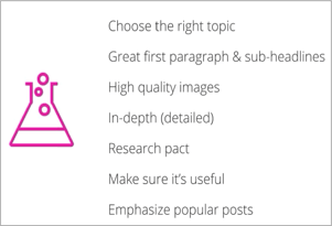
 If you are choosing between posting more or posting better, do yourself a favor and post better. The recipe for a good post is no great mystery. The content needs to be in demand, covered in detail, actionable, and well researched.
If you have great ideas but can’t manage to weave it together into a perfect post, relax. Start by investing in your headline and first paragraph, and take it from there.
Another way to make your content standout is to include high quality images (a great resource for free images is Pixabay), or create your own unique images using a graphic design tool such as Canva.
3. Content Upgrades: But Wait… There’s More
What’s a content upgrade? I’m glad you asked. It’s a simple growth hack for which you create content - that compliments existing content.
Suppose you write a blog post on, “5 Ways to Get More Conversions From Your Blog.” Naturally, it was a smashing success, going viral and lighting up the Internet.
A great way to get more out of the same content, is to expand the list to a downloadable eBook, such as “The Ultimate Guide to Blog CTA Design.”
Content upgrades come in many different forms, such as:
- Infographics
- Checklists
- Case Studies
- Link Packages
- Templates
- How-To Videos
Basically, to drive blog conversion rates, show your audience that you have more of what they want. The blog post they read was likely available to everyone – but the content upgrade should be gated, so you can get their contact details for future nurturing.
Keep in mind that it’s crucial to demonstrate restraint in offering content upgrades. To retain its potency, this technique should be reserved for your best performing content. If overused, content upgrades can begin to resemble a spam campaign and undermine your brand image.
4. CTAs & Content Marketing: Wearing Black & Navy?
Proud of their offerings, bloggers are often so eager to get publish their CTAs that they end up putting them where they don’t belong.
Aligning CTAs with content is extremely important to prevent confusion and keep the value proposition clear. If someone is on the right page, the wrong TA can muffle the message and send them packing.
The offer must also be in line with the specific content on that page. If, for example, a visitor is reading a post about social media marketing, the
CTA offer can be to download a white paper on generating leads with Twitter – it shouldn’t be about using marketing automation, which is irrelevant to the topic. The point is to leverage the interest you’ve already secured from the reader, and give that person more on the same subject.
A great method that Roy suggests to keep the alignment sharp is to:
- Choose 6 topic categories to write about
- Create a resource for each category
- Create a CTA for each resource
- Add related CTA/resource to post as per category
5. CTA CTA CTA: If At First You Don’t Succeed…
Marketers, you may need to ask for the conversion multiple times by featuring your CTA in duplicate forms. Conversion should be among your blog’s foremost objectives – so don’t hesitate to give people the opportunity to convert.
Here’s a quick tip from Roy - CTAs in green and red fonts show better conversion rates when compared to alternative colors.
Like content upgrades, CTAs can come in many various forms, each of which has pros and cons. You may want to use different CTAs in a range of positions on your blog.
Your options include:
- The Top Bar: This bar is prominently displayed, visible to 100% of you visitors, and integrates nicely into the sites menu. Try the Hello Bar, and make sure to feature a concrete offer – such as an eBook or webcast.
- Bottom of the Post: On one hand, readers are less likely to scroll all the way to the bottom. However, you know that if they do – they must be interested in reading more. This is exactly where interested and engaged readers look after they’ve read the entire post and are looking for more information.
- Pop-ups: Everyone knows what a pop-up is. Some people hate it, while others swear that, if done properly, it remains among the most effective CTAs. Weighing in on this debate is beyond my paygrade. But if you do opt for a pop-up, Roy recommends a 5-7 second delay to make it less disruptive.
- Sidebar Box: The sidebar box stretches the length of the page, allowing a CTA to accompany the content more or less for the entire visit. This offers a balance in being present without intrusive.
Remember, using a combination of CTA forms is a good thing, so play around a little and find what works best for you and where!

by The Penguin Team on June 16, 2015
As a leading B2B digital marketing agency, We help B2B Technology Companies, enterprise software, and hardware companies increase brand awareness, reach more qualified leads and close more customers. Penguin Strategies is a Diamond Partner of HubSpot.


